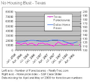
A while back I mentioned this in an op-ed, but I thought that a graphic representation would be good to see. I updated the numbers to reflect the most recent available data from RealtyTrac.com and Case-Shiller. I think the graphs speak for themselves.


No comments:
Post a Comment